New Red Sox Logo and Uniforms Introduced by Fat Old Guys (LOOK DECENT)
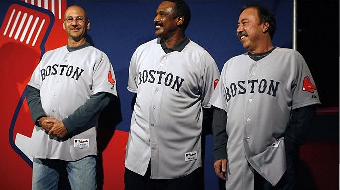
I'm not sure Terry Francona, Jim Rice and Jerry Remy were the best choices to unveil the new Red Sox uniforms for next season. Just look at these porkers. I wouldn't exactly call them "models". These dudes could barely fit their guts in these shirts without almost popping off some buttons. They look like Chris Farley in "Fat Guy in a Little Coat". Can we just stop with this concept of managers wearing uniforms by the way? It's just disgusting. At least Francona tries to hide the belly with his jacket. I appreciate that, Tito!
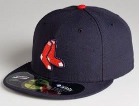
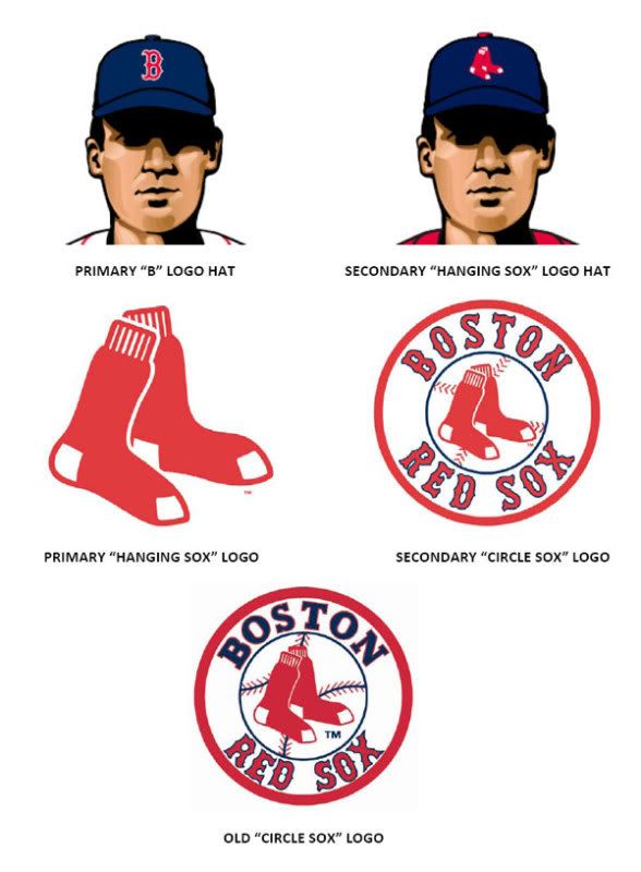
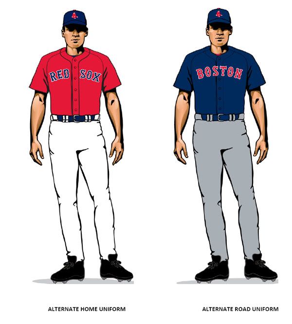
Overall, I can get down with the changes. I'm not sure they were really necessary but it's another way for the team and MLB to snag some more merchandise dollars from Red Sox Nation, so why not? It's not like we're in a recession or anything. Jesus. I refuse to buy any of these new jerseys because 1) I am over age 13 and 2) They cost about $80+ depending on how "authentic" the version is that you are purchasing. It can get up to about $250 for the legit game jerseys. Why would you make that buy considering how often people change teams these days? I just don't get it. Moving on...I do like the hanging Sox logo hat but it kind of looks a little cheap like a Spring Training hat or something you would find at Lids. I'll stick to the O.G. Big B, thank you very much. Don't EVER mess with the classic, please!!
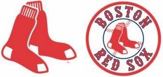
The new round logo is decent but I kind like the old one better. I like the blue lettering on the Boston a little better than the all red on the new one. It just seemed to separate it better and put an emphasis on Boston and Red Sox separately. Not sure why that matters but I liked it.
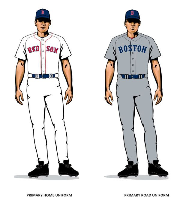
Finally, here is a look at the Away and Alternate uniforms. I like the blue lettering on the Boston across the chest on the standard away all grey unis but I don't like the choice of lettering. I think it's because I am so used to that style being used with the red and blue outlined look of the past few years. If you are going to go all blue, I think it would have made sense to go back to the old school look from 1986 with the simple block letters. Those away jerseys were always one of the best in my opinion. I didn't like it when they made the switch to red and different style letters in the late 80's or whenever that happened.
Overall, I do like the changes even though I am being critical here. I think teams need to make updates every 5-10 years to stay current and also benefit from that extra revenue that comes with the changes. I just wish they would use that extra revenue to keep ticket prices down or build a new stadium.
